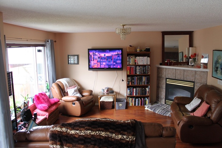
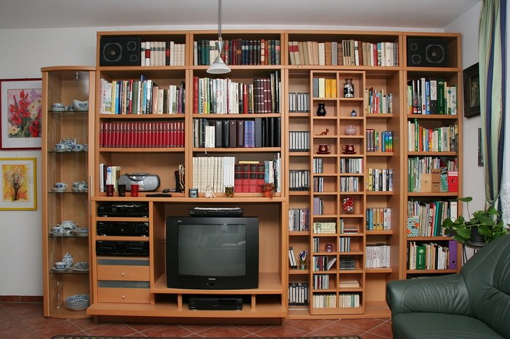
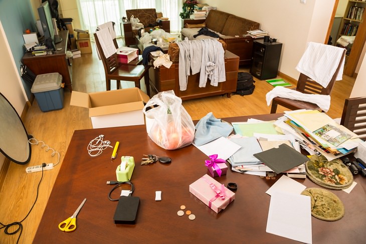
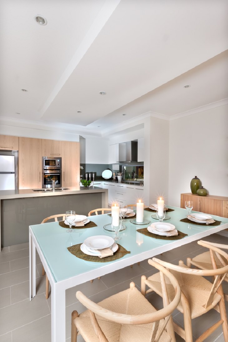
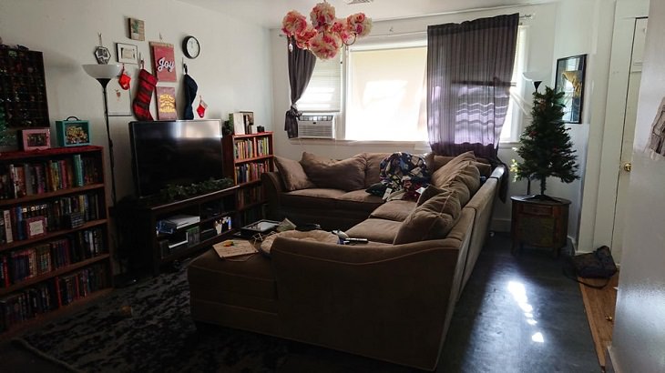
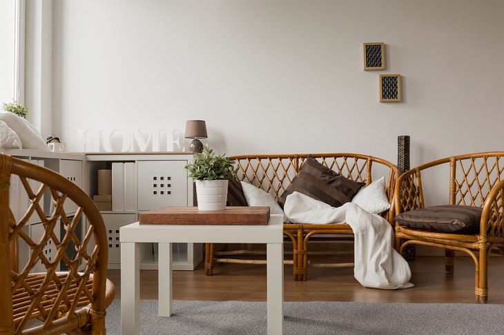
Having too much furniture in a room is a common interior design mistake. "Less is more" should be the rule of thumb when it comes to furniture placement, as cramming in too much will make your room feel cluttered and will negatively impact the flow of the space. Your home should never feel cramped and chaotic. So, try and maintain a decent distance from the edge of the sofa to the edge of the coffee table. Experts recommend keeping a minimum of 18 inches between your seating and your coffee table to achieve an overall aesthetic that is pure, simple, and spacious.
Another good idea is to start with a large sofa, or a similar big piece, and build around it. For example, you don’t need to have two chairs flanking the sofa. Just add a chair and a small side table instead. This will create balance in the room. Opting for a few quality, low-profile pieces that will fill the area while also leaving enough open space between items will achieve a similar result as well.
2. Pushing furniture against the walls
Many a time, we choose to push all the furniture against the walls in an attempt to make the room look bigger. This can be counterproductive because this can create dead space in the center of the room. The point is that not all furniture pieces need to go against the walls; you can create a comfy space by arranging the pieces starting from the center of the room.
For instance, just leave a few inches between your wall and sofa or chair, and you will find that it creates a more inviting and warm environment in the room. Also, pulling the furniture away from the walls will create a better sense of balance in the room and give it a more intimate feel.
3. Leaving no room for navigation
When you're organizing furniture, make sure that it’s conducive to navigation. As shrewd as you can be while planning your furniture arrangement, it can often disrupt the traffic flow and make it difficult for people to make their way around all of it. Even if your living space is small, you should place your furniture in a way that doesn't require you and others to climb or trip over one piece just to get the other one. Also, you shouldn’t have to make your way through the room by zigzagging through the tables and chairs. After all, someone may end up bumping their legs or tripping on their way.
Thus, you must leave plenty of room to move around while organizing your furniture. Take note of how people enter, exit, and navigate through the room. This will help you plan and make the most out of your space while also taking navigation into account. Remember that it's always important to leave a clear path between the various entry and exit points in your home, so make sure that no furniture blocks the way in those places.
4. Letting the table in the kitchen take up too much space
You may feel that having a gigantic dining table in your kitchen is convenient because it allows your entire family and a few occasional guests to eat comfortably in one space. But before you purchase any large item, check and see whether or not it’s taking up too much space. A larger-than-necessary dining table can take up more than half of a kitchen or dining room, and you may be left with very little room to move around freely.
If you already made this mistake, here's a possible solution: consider using benches for seating in the kitchen. An upholstered bench or even a wooden one with a decorative topper will work great, as they can easily slide under the table and won’t take up too much space.
5. Positioning a couch with its back facing the entrance
Placing a sofa with its back to the main entrance is a big no-no, according to interior designers. This is primarily because people sitting on the sofa won’t be able to see the people who walk in, which can be pretty awkward. Also, this placement is bound to give you that uncomfortable feeling that someone might just sneak up on you from behind.
Ideally, your sofa should be arranged in a way that allows decent movement and flow. When guests enter your home, they won't want to see the back of your heads, would they? So, just position your sofa against a solid wall with a view of the main entrance.
6. Placing a bed under a window
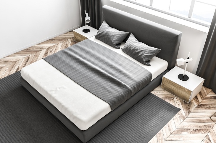
Placing a bed right under a window won’t just look odd from the street, it can also lead to many practical problems. The constant noise from the outdoors can lead to stress and anger. Moreover, the pollution from outdoor air can be unhealthy for you. Furthermore, the bright light entering your room disrupts your natural sleep cycles and makes you feel less rested in the morning. All of these issues combined can result in poor sleep, diminishing energy, and other issues.
Ideally, your bed should be placed head up against a windowless wall so that it gets solid backing. That said, if under- or near a window is the only available spot for your bed, then make sure that you hang floor-length curtain panels that cover the headboard and block the back of the headboard from the window.
7. Disregarding smaller furniture
The furniture in your house doesn’t always have to be huge to serve its main objective. A sofa or a table that's too large can easily eat up space in your living room or bedroom. If that is the case, it's a good idea to go for smaller items. For example, an oversized sofa or armchair can only be fit in one corner of the house, but smaller versions of the same can be moved around more easily. Moreover, smaller sofas, slimmer console tables, and little end tables will make a small living room look more spacious and organized.
Share this article with those who might find it useful!

