1. Incorporating Dark Colored Furniture in Small Spaces
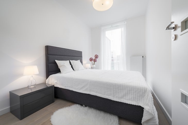
When it comes to smaller living spaces, such as apartments, narrow rooms, or corridors, one of the biggest mistakes people make is incorporating dark and bulky furniture. While dark brown, grey and black pieces may sound like a safe choice, it can really emphasize how small or narrow a room is.
The goal in these kinds of rooms is to lift and trick the appearance of a broader space, and the best way of doing so is by using lighter colors, or even transparent or reflective pieces, as well as lightweight and fluffy fabrics.
2. Not Considering Scale and Proportion
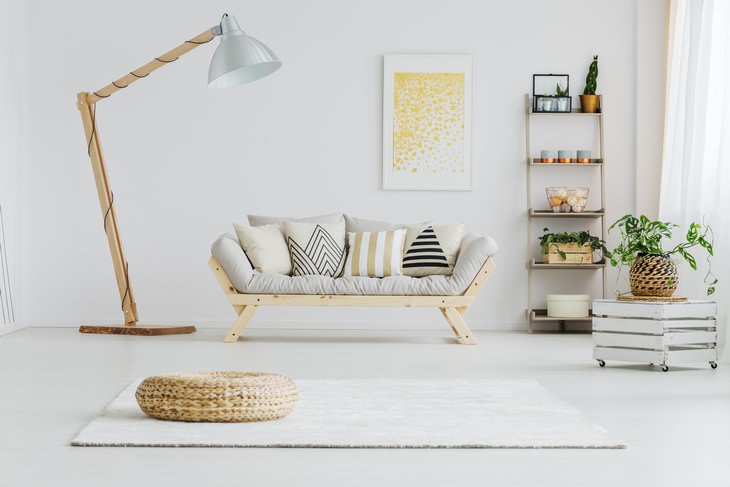
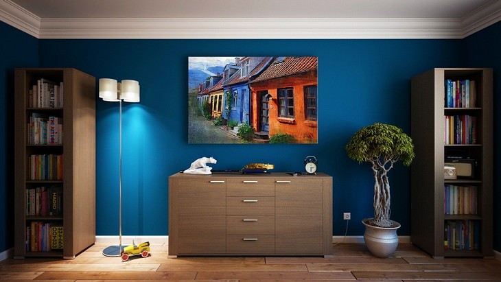
Do you just wish that the oversized lamp on the left was half its size? This isn't surprising, as this huge lamp, though an interesting piece in itself, doesn't fit the other items in this room in terms of size at all. A lone bulky item like this in one room makes the entire room look stuffed and small, it literally dwarfs its surroundings.
To remedy this mistake, it would be wise to add at least one more large item in this room, such as a larger sofa, for example. Remember that the secret to proper scale and proportion is mixing a variety of different sizes, heights, and shapes.
3. Unique and Bright Colored Furniture Can Be Difficult to Repair or Replace
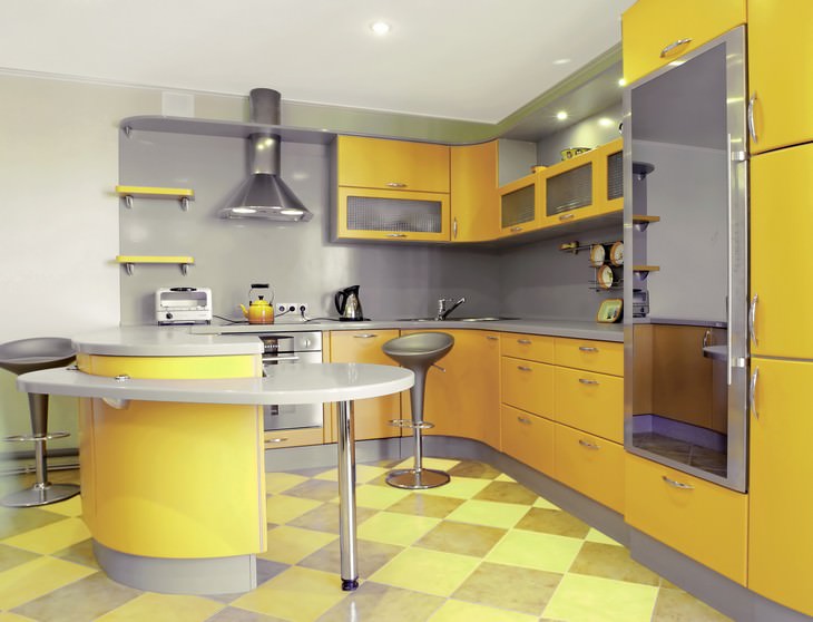
When it comes to interior elements that are difficult to replace, such as tile, countertops, doors, built-in furniture, and cabinets, it's always advisable to opt for universal colors, textures, and finishes. This is because finding a suitable replacement when fixing these pieces always proves difficult, as these trendy items come and go off store shelves.
Apart from that, it might be a good idea to stick to pieces with simple shapes and plain colors because you might get tired of the more bright-colored and unique items quite quickly. This kitchen, for example, while quite cheerful looking, will surely fall out of fashion in less than a few years, and is bound to turn into an eyesore.
Don't get us wrong, incorporating trendy statement pieces is an excellent way to spruce up a room's interior, but it's best to do so with items that are easy to switch up when you get tired of them.
4. Overcrowding Storage Spaces
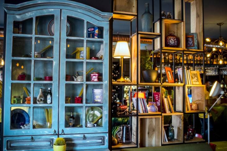
If the room in the picture above looks crowded and cluttered to you, you're not alone. The problem with this shelf arrangement is the oversaturation of space with small objects or varying colors, and we see this mistake everywhere, not only on bookshelves or cupboards.
To avoid this mistake, simply cutting down on the number of items won't cut it, as you have to also make sure to switch up the sizes and shapes of objects. If you have a collection of accessories you love, another hack you can do that will trick the eye into believing you have less stuff is grouping the items together according to color or size in groups of three instead of just showcasing them one next to each other. Try it, it really works!
5. Hanging Paintings and Shelves Too High
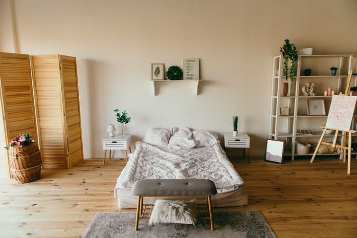
One way to make the room really awkward is to hang shelves and especially art too high. This is especially true in situations where there is only one shelf or artwork that acts as the centerpiece of a room, as is customary for bedrooms. In the example above, for example, the shelf right above the bed is hung a bit too high, which makes the bed and nightstands shrink in size and the wall appear way too bare.
In most cases, you should hang artworks and isolated shelves at about eye level, or about 145-150 cm (57-60 in) above the floor level.
6. Having Only One Light Source in a Room
A minimalistic approach is the best way to go in many aspects of interior decorating, but sticking to the bare minimum when it comes to indoor lighting isn't such a great idea. Instead, layer different lamps and lights in every room, combining wall lights, standing lamps, and even chandelier lights together.
This will add an unexpectedly pleasant ambiance to each room and will give you more control of the lighting situation in your home. Apart from that, we recommend opting for daylight bulbs instead of bright white ones for most spaces in your home, as the latter make the room less cozy.
7. Including Colors That Are Too Contrasting
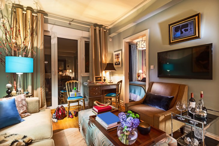
The art of color matching is key when it comes interior decoration. A room where all pieces contrast each other will appear garish and gaudy, and each of these items comes off as eyesores. The room above, for example, lacks cohesiveness because it combines cream colors and earth-toned items with electric blue, green and purple.
Switching up or removing some of the bright colored items, such as the table lamp, the chairs, and even the painting would hugely improve the appearance of this room.
8. Matching Furniture and Colors Can Make the Room Look Too Museum-Like
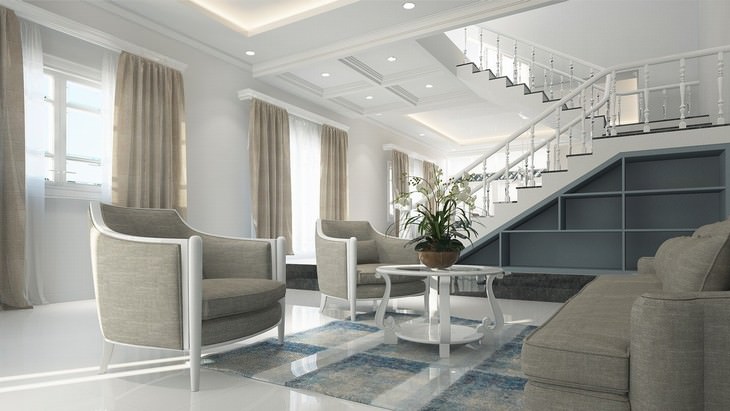
Just like extreme contrasts are a big interior design mistake, so is a room that looks too matchy-matchy. So, if matching your couch or one of the armchairs to the curtains can make your interior nice and cohesive, matching the couch, the armchairs, the curtains and the rug will make your room look washed out and, frankly, boring, just like the example above illustrates.
A good workaround trick is to use the items of the same color family, but varying textures. This will be able to add a bit of interest to even an all beige room. But color isn't the only thing you should pay attention to, as having the furniture from the same set, too, can make the room look more like a catalog or an office waiting room than a comfortable living space.
To prevent this from happening, resist buying a whole set of furniture and try to incorporate pieces of various ages and shapes, as well as those made of different materials in one room.
9. Having a Rug That's Too Small for the Room
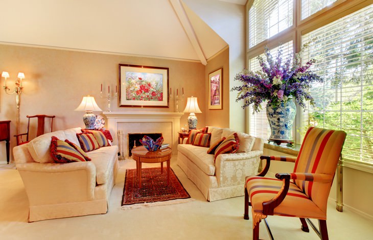
Another item that can throw off the proportions in your room completely is the rug. Even if it's just a tad too small, it can visually shrink the room. Just look at the example above - the Turkish rug in the middle of the room makes the sofas and the space between them a lot smaller.
In this case, and many others, it would be much easier to forego the rug altogether, especially since these can be very expensive. If you do insist on having a rug in your home, make sure it covers the space underneath all the legs of the main furniture in the room.
10. Hanging Curtains That Are Too Short
A final remark in this article is related to drapes and curtains.
It's no secret the vast majority of people intend to make the rooms in their home appear more spacious, but a detail as small as curtain length can undermine those intentions in an instant. Make sure that the curtains in each room reach the floor, as even slightly shorter drapes or curtains can create the appearance of a lower ceiling and a living space that looks cramped and unfinished.

