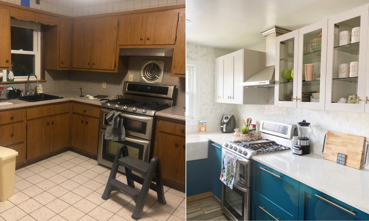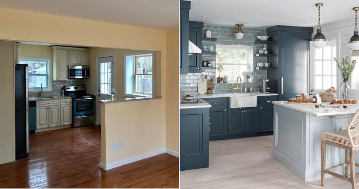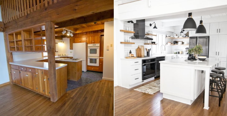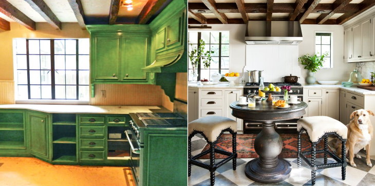

Click on the arrow or swipe right on the photo to see the before picture
Don't underestimate the power and space that can be created by maintaining a monochromatic and minimalistic look in your kitchen. The simple design of this black and white kitchen consists of clean lines and looks virtually timeless!
Related Article: Surreal Home Designs

Click on the arrow or swipe right on the photo to see the before picture
While an excessive abundance of color and texture may make your kitchen look too busy, using patterns and textures in a smart way can actually upgrade your kitchen. In the photo above, for example, they've used furniture with a natural wooden finish and wicker baskets and chandeliers to imbue the kitchen with some character. Also, note that all these elements are in light colors - this helps to really tie the room together!
Click on the arrow or swipe right on the photo to see the before picture


Click on the arrow or swipe right on the photo to see the before picture
The main beginner's mistake when remodeling a home is the lack of cohesion. You might pick all new furniture, tiling, and kitchen appliances, you might even like all of them a lot, but when you combine them all, the result can be underwhelming... and often even kitschy.
This is because you have to always think of a unifying theme or element that would marry all the separate elements in a kitchen, and the easiest and most controllable element is color. Just look at the before and after photos of the kitchen above - the light grey color really unifies and makes the room look cohesive.
Click on the arrow or swipe right on the photo to see the before picture
In the majority of examples we've featured previously, the kitchen furniture was swapped out for a new set, but many will know that furniture is one of the biggest investments when renovating a kitchen. If you want to give your cabinets a fresh and new look and make your kitchen look much better, you can achieve that goal easily by just painting and changing up the handles and knobs. This is exactly what they did here - they've simply repainted the top cabinets, and voila, they instantly look brand new and modern.
Click on the arrow or swipe right on the photo to see the before picture
Here, too, the owners decided to repaint their old furniture, but they switched up the floor, tiling, the backsplash, and the dishwasher. However, the main change we see here is in the amount of stuff stored in the kitchen. In the before picture, there were too many decorative elements scattered all over the countertops, which really left no space for food preparation.
It's fine to love your trinkets and beautiful decorations, but it's smart to confine them to only one area in the room like they did in the after photo. This way, you'll have all the room you need to make food and do the dishes, and it looks neater, too!
Enjoyed this article? Why not share it with others?